Visualizatons & Reports
Table of contents
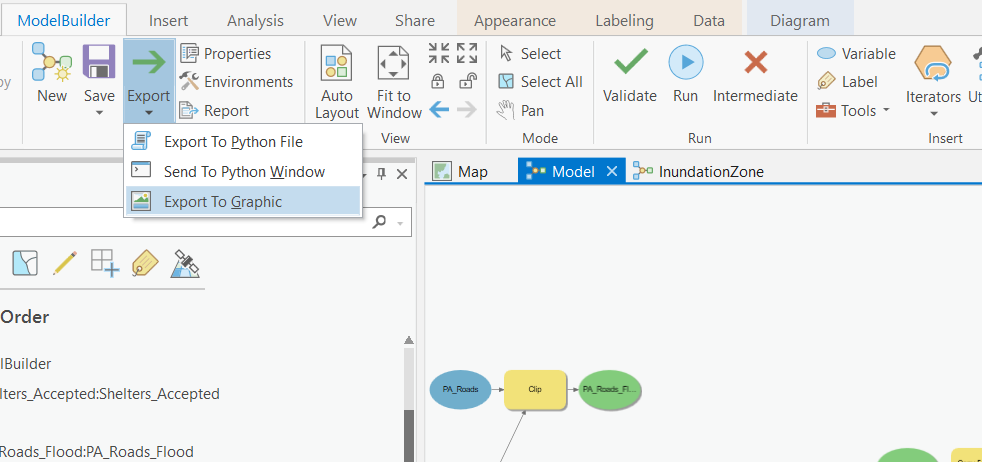
Export Your Model
In your model window, hit Auto Layout one more time. Then click export and save your model as PA_RiskAssesment_Model.pdf. Note Make sure you save your output as a .pdf, not a .svg file! You will upload this to canvas.
Supporting Figures
Create a bar chart showing the total count of properties at risk by ZoneName. Style it so that it is color-coded by zone type and has the counts labelled on each column. Save it as Properties_at_Risk_Chart.png and export it so you can upload it to canvas.
Map the Assessment
Create a map showing the the Inundation Zone, roads at risk of flooding, properties at risk, and approved shelter locations. Use the Symbology to emphasize the Arterial Roads, distinguish between residential and non-residential properties that are at risk, and show the shelter locations with graduated symbols. The video below gives you some tips. Note Make sure to take into consideration the Data Visualization tips presented in Module 3 when creating your maps. Name your map PA_RiskAssessment_Final_Map.pdf and upload it to canvas.
Report on Your Results
Write a brief (1 page) summary reporting your findings for the City of Port Alberin. Save your write as a .pdf, named PA_RiskAssessment_Summary.pdf and upload it to canvas. The summary needs explicit answer the four questions questions:
1 Which roads are at risk of flooding or damage?
2 Which properties in the city are at risk?
3 How many people in Port Alberni are potentially living in areas at risk?
4 Are the Tsunami Shelters sufficient?
You should briefly summarize the analysis steps you used to conduct the Tsunami Risk Assessment and explain your findings referring to your chart, map, statistics (population at risk, length of roadways flooded, etc.) where applicable.