Data Visualization
Displaying patterns in data, emphasizing aspects we think are important, conveying our results.
Cartography
The study and practice of making maps.
- Why do we make maps?
- To transmit spatial information to a map reader.
- Data/Analyses are meaningless, unless conveyed in an understandable way.
- Decide what you want to communicate and to whom.
Good Maps
- Accessible to target audience
- Clean and easy to read
- Can be quickly interpreted
- Aesthetically pleasing
Bad Maps
- Misses target audience
- Cluttered and ineffective
- Easily misinterpreted
- Ugly
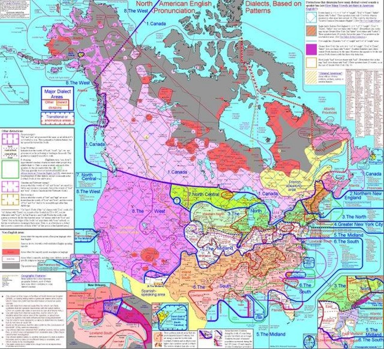
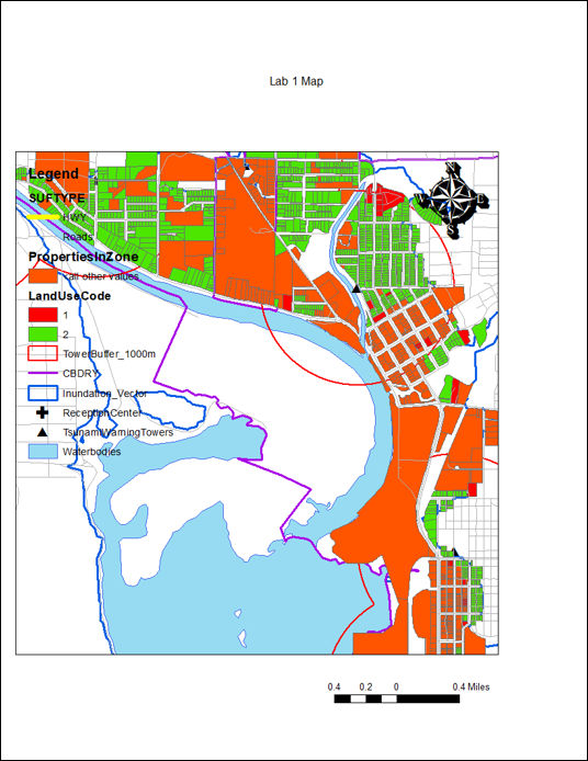
A Bad Map
Excellent example of a bad map showing really interesting information.
- Too much information
- Too many colors
- Text is way too small
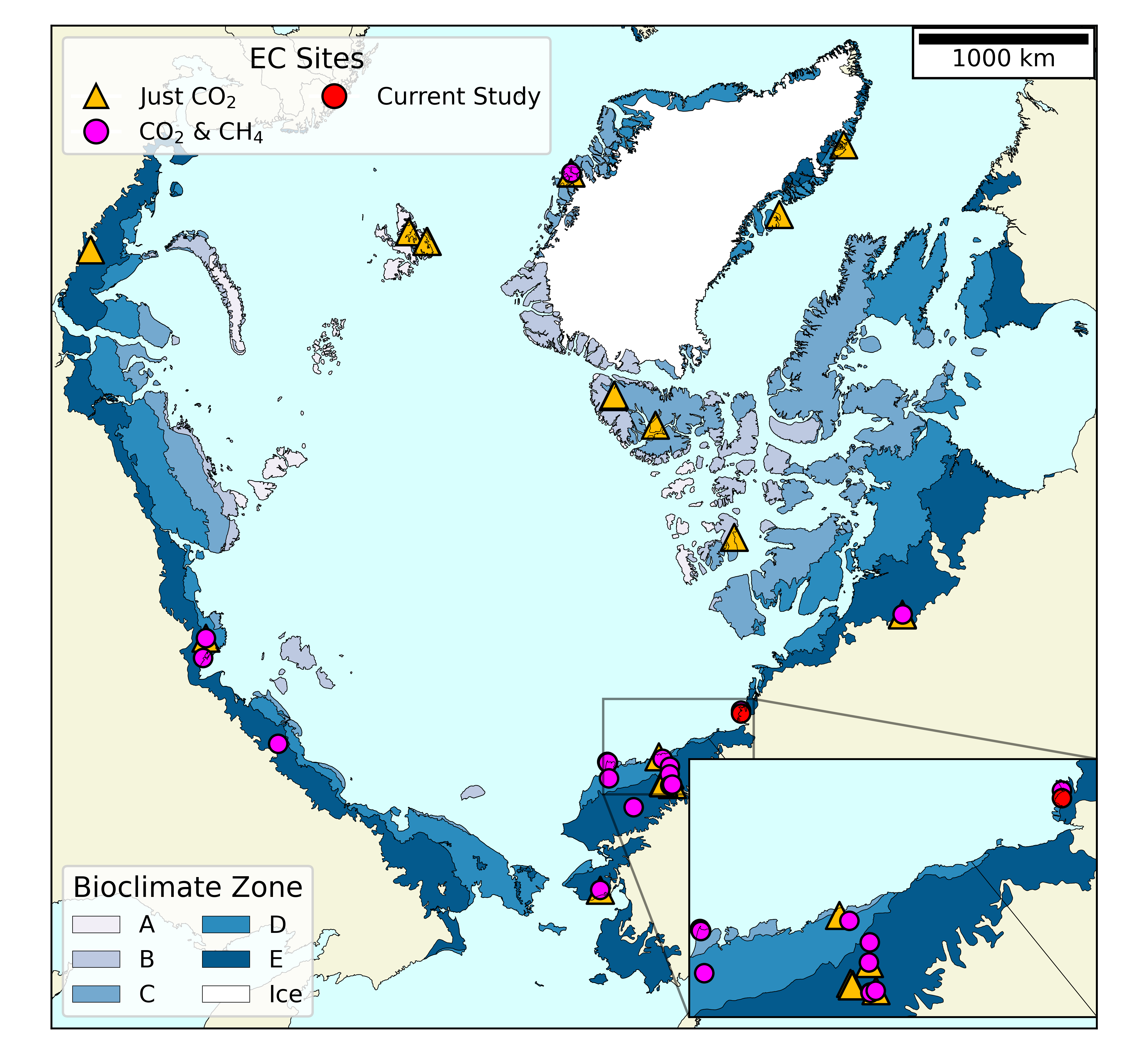
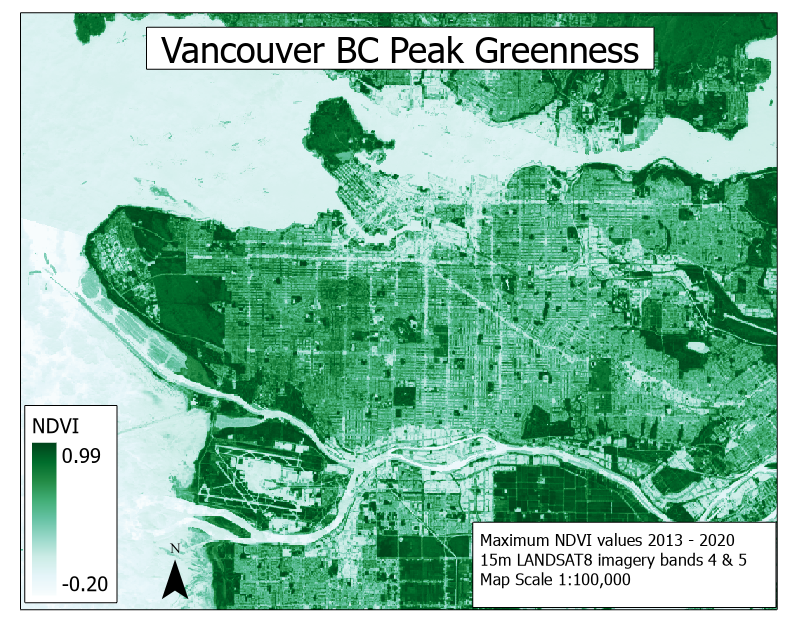
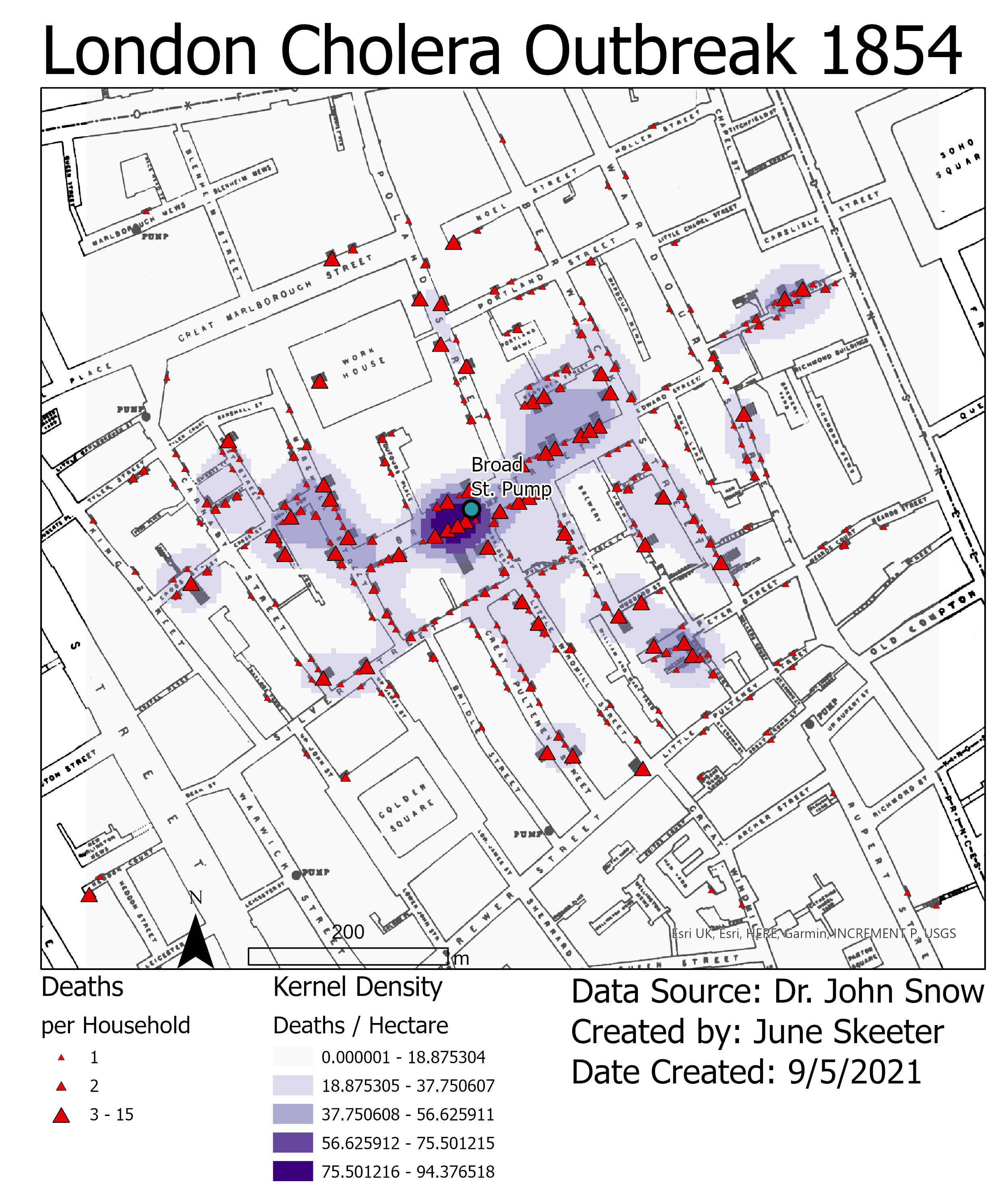
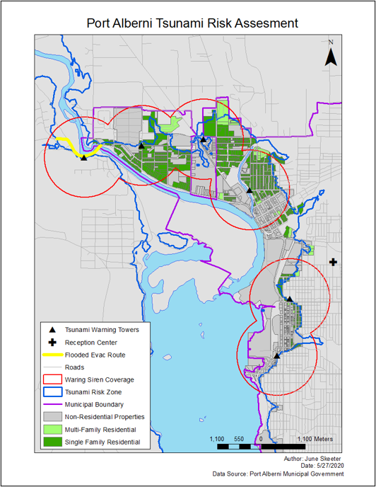
A Better Map
Cleaner, less complex presentation
- Distinguishable features
- Less information
- Suitable fonts
Design Principals
Give the viewer the most information in the shortest time with the least ink in the smallest space.
- Complex ideas communicated with clarity, precision, and efficiency.
- Maximize data-to-ink ratio (i.e. more data, less other stuff).
- Erase non-data ink, within reason.
Design Principals
The best maps can be interpreted quickly and easily.
Design Principals
The best maps can be interpreted quickly and easily.

Data Symbolization
The shapes, characters, colors, lines we use to represent information on a map.
- The choices we make will convey aspects of the data.
- Some colors/sizes/shapes lead to assumptions.
Data Symbolization
Ask yourself: Discreet or Continuous?
Discreet
- Points/Lines/Shapes
- Different Hues (colors)
Continuous
- Surfaces, contour lines
- Different shades/intensities
Data Symbolization
Ask yourself: What measurement scale?
Nominal
- Dashes, Shapes
- Different Hues (colors)
- Do Not choose colors or sizes that imply a difference in magnitude.
Ordinal/Interval/Ratio
- Different shades/intensities, graduated symbols
- Do Not choose colors or shapes that imply a difference in category.
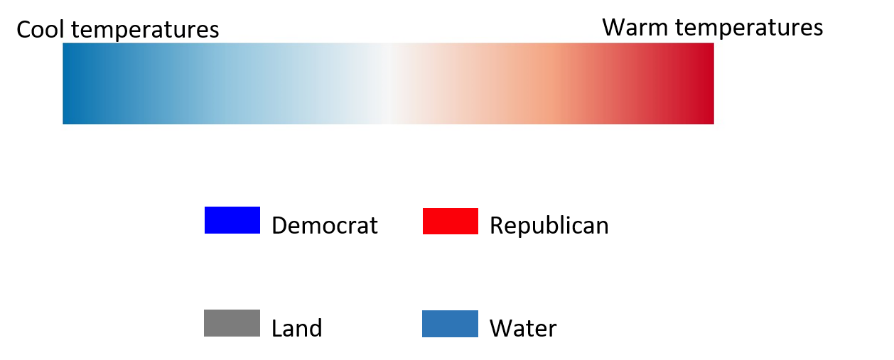
Color Choice
It is important to choose the right kind of color map.
- Sequential: Gradation of shades one hue (color).
- Diverging: Gradation of shades opposing hues, from a central point.
- Qualitative: Different hues of the same shade.
Sequential: Ordinal/Ratio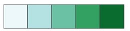
Diverging: Interval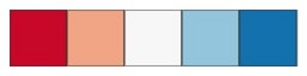
Qualitative: Nominal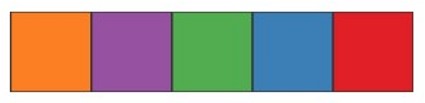
Color Choice
Some colors have implicit assumptions depending on the context.
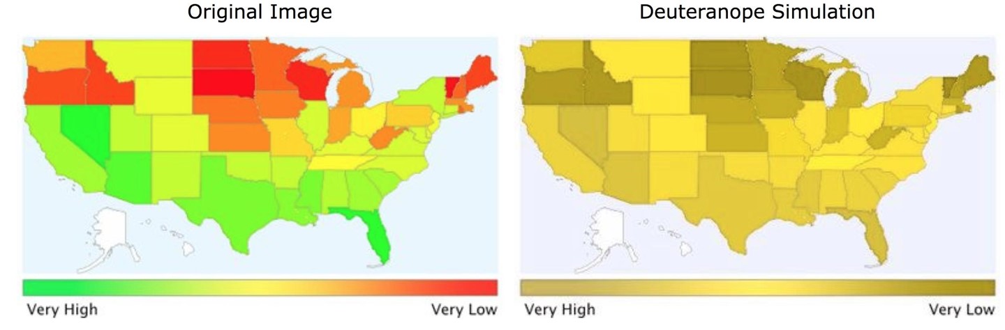
Color Accessibility
About 4.25% of people are colorblind, red-green is the most common. Color Brewer is a great resource.
Visual Hierarchy
Our perception is influenced by the order in which we see things. The relative importance of features is implied by the layout & size.
Placement
- Center first
- Top to bottom
- Left to right
Font Size
- Large
- Medium
- Small
Shade
- Light
- Medium
- Dark
Stylistic Guidelines
- Clear labeling to prevent ambiguity and confusion.
- Minimize assumptions about your audience.
- Proof your map text.
- Consider if all map elements are necessary.
- Scale bars, North arrows, etc.
- Minimize “chart junk”
- Use appropriate color schemes.
- Colorblind friendly
- High contrast
- Suited for data type
Stylistic Guidelines
North arrows scale bars
- North arrow - doesn't work in circumpolar area, not needed if its a familiar region
- Scale bar - not needed if its a familiar region, unless navigation is important, scale text can often suffice
Stylistic Guidelines
North arrows scale bars
- North arrow - needed if it's not a familiar region or if north is not up
- Scale - needed if it's a familiar region or if multiple maps are at different scales
So Many Mistakes!!
- Poor use of map space, wasted white space, not centered
- Poor color choice
- Not all map elements are visible
- Text/font issues
- North arrow - placement/size
- Scale bar - wrong units!
So Many Mistakes!!
- Legend issues
- Avoid unnecessary text
- Get rid of underscores, make sure entries are meaningful
- No name, affiliation, source
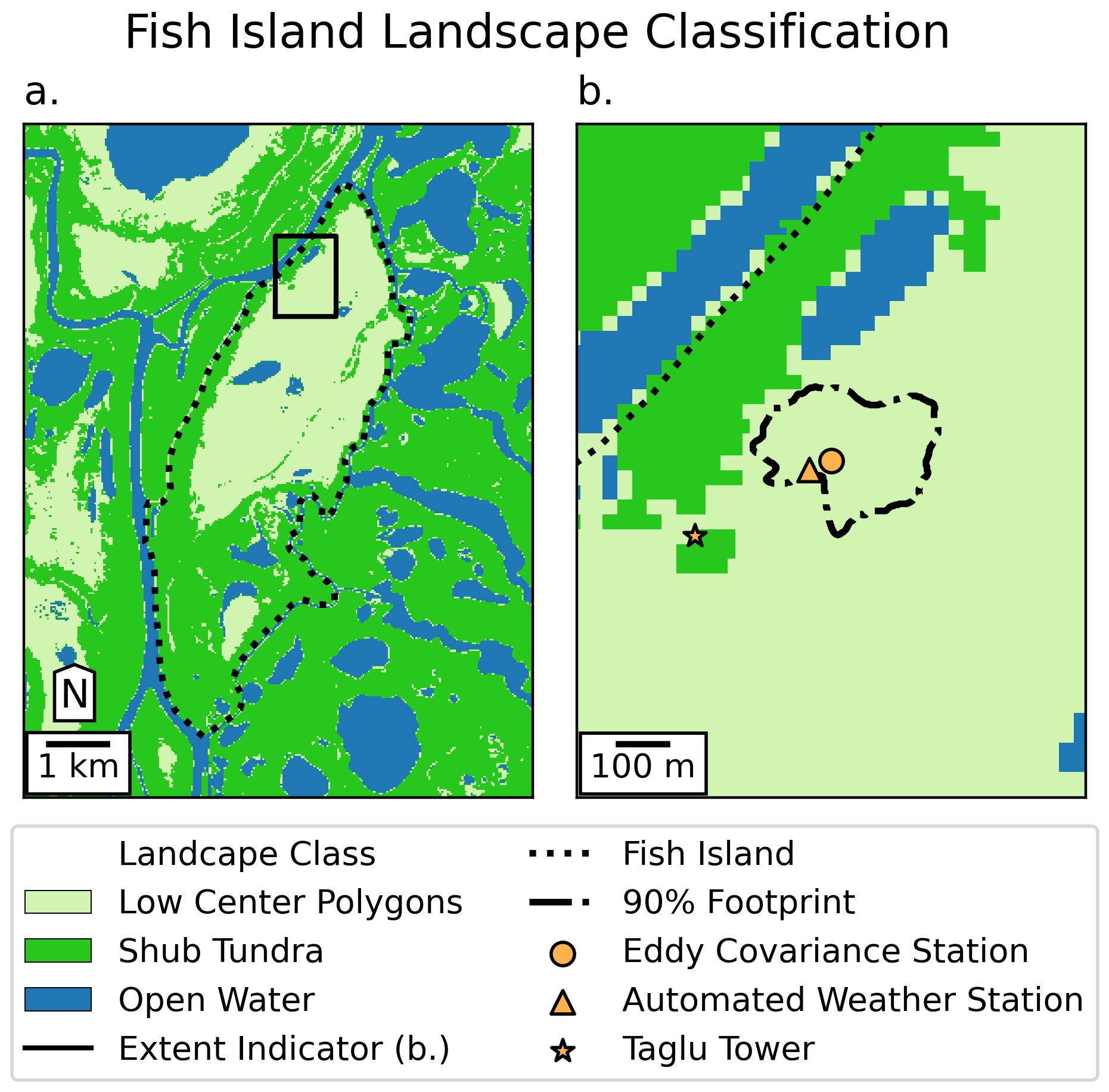
Cleaner presentation
- Area of interest takes up most of the map space.
- Name, affiliation, source.
- More meaningful legend entries.
- Proper sizing/placement of map elements.
- More pleasing color choice, easier for colorblind people to read.
Stylistic Guidelines
These are just guidelines!
- Cartography is an art, there are no steadfast rules.
- Just best practices.
- Play around with styling, just be able to justify your choices.
- Not all spaces “want” to be mapped, sometimes you need to make aesthetic compromises to make an effective map.